KANA Extracts
Partner • Creative Direction • Brand Dev • Packaging • Marketing • Ops • Procurement • yeah, that's enough
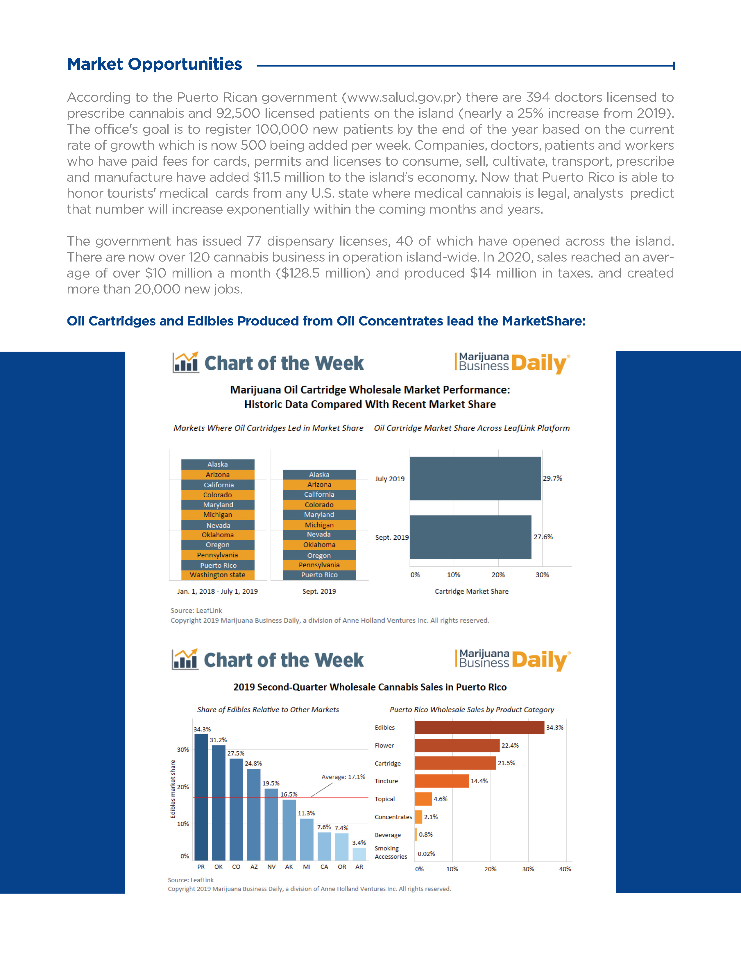
In 2018, a former vendor and friend approached me about building a medical cannabis brand in Puerto Rico. The hard parts were already in place: a facility, master grower, chemist, head of production, and a potential partnership with FarmaVerde, the island's largest vertically integrated seed-to-sale operation. They just needed someone to build the brand. There was one small problem: I knew absolutely nothing about cannabis. Apparently, that wasn't going to stop me. After several trips and a lot of negotiation, I signed on as a co-founder and Chief Creative Officer. What started as a branding job quickly became...well, pretty much everything. Business plan. Brand identity. Packaging. Marketing. Vendors. Production. Compliance. Banking. You know. The usual CCO stuff.

Overview
KANA needed more than a name, logo, and pretty package. It needed a complete brand and operating system capable of taking a new product from concept to retail shelf.
From 2018 to 2022, I built KANA from the ground up, developing the brand, packaging, marketing, and customer experience while establishing the operational systems needed to manufacture, distribute, and grow it.


Role & Scope
I wasn't just responsible for making KANA look good. I built the customer-facing brand while also helping build the machinery behind it.
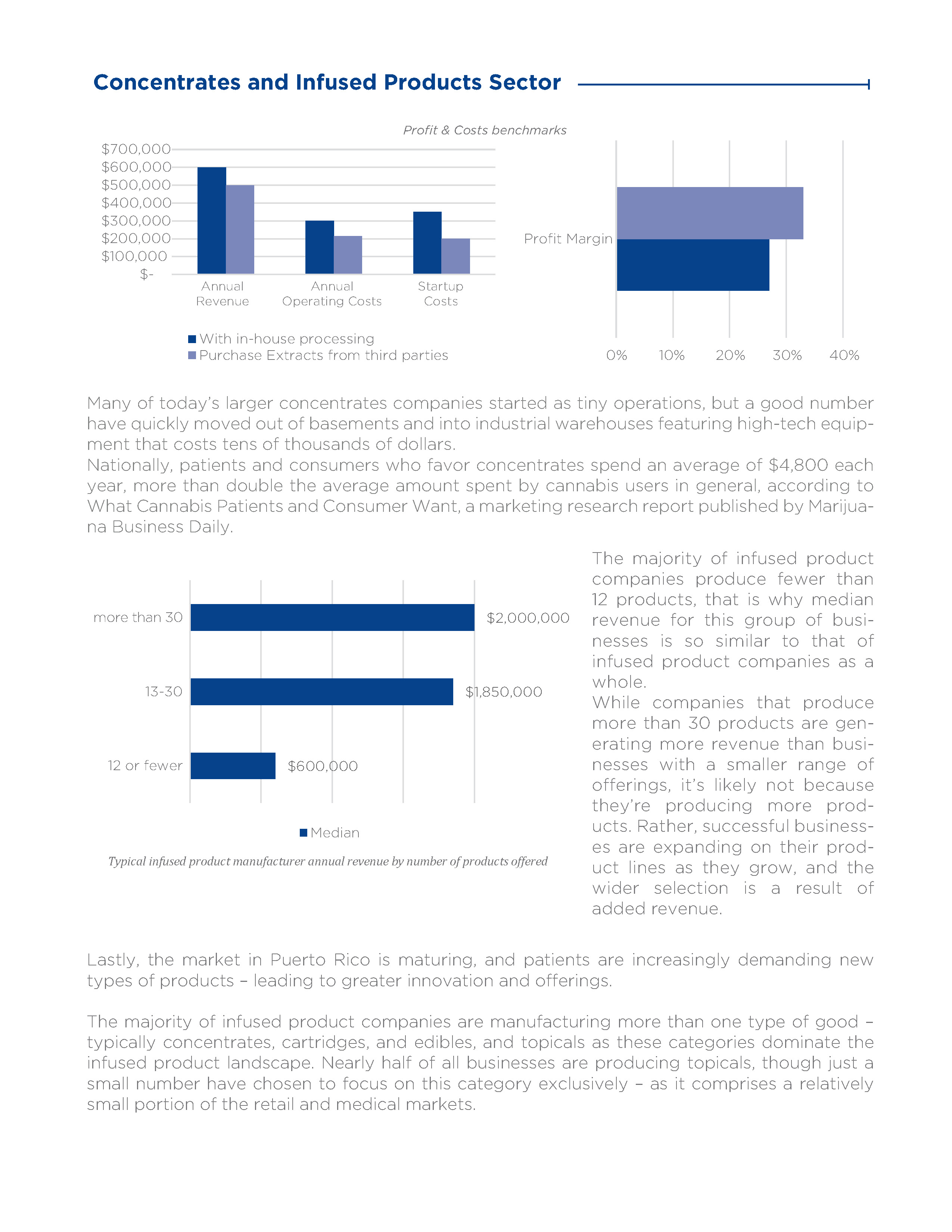
That meant brand development, packaging, marketing and content, purchasing, inventory, documentation, production, and vendor management across the U.S., China, India, and Pakistan. I also managed $350K in production and marketing spending while negotiating vendor pricing and agreements.
$1.6M
Gross revenue within 24 months
18
Months to become the 2nd highest selling brand in PR
30+
Retail locations within 18 months
65%
Reduction in vendor
and production costs by year two
Approach
Branding and Foundation
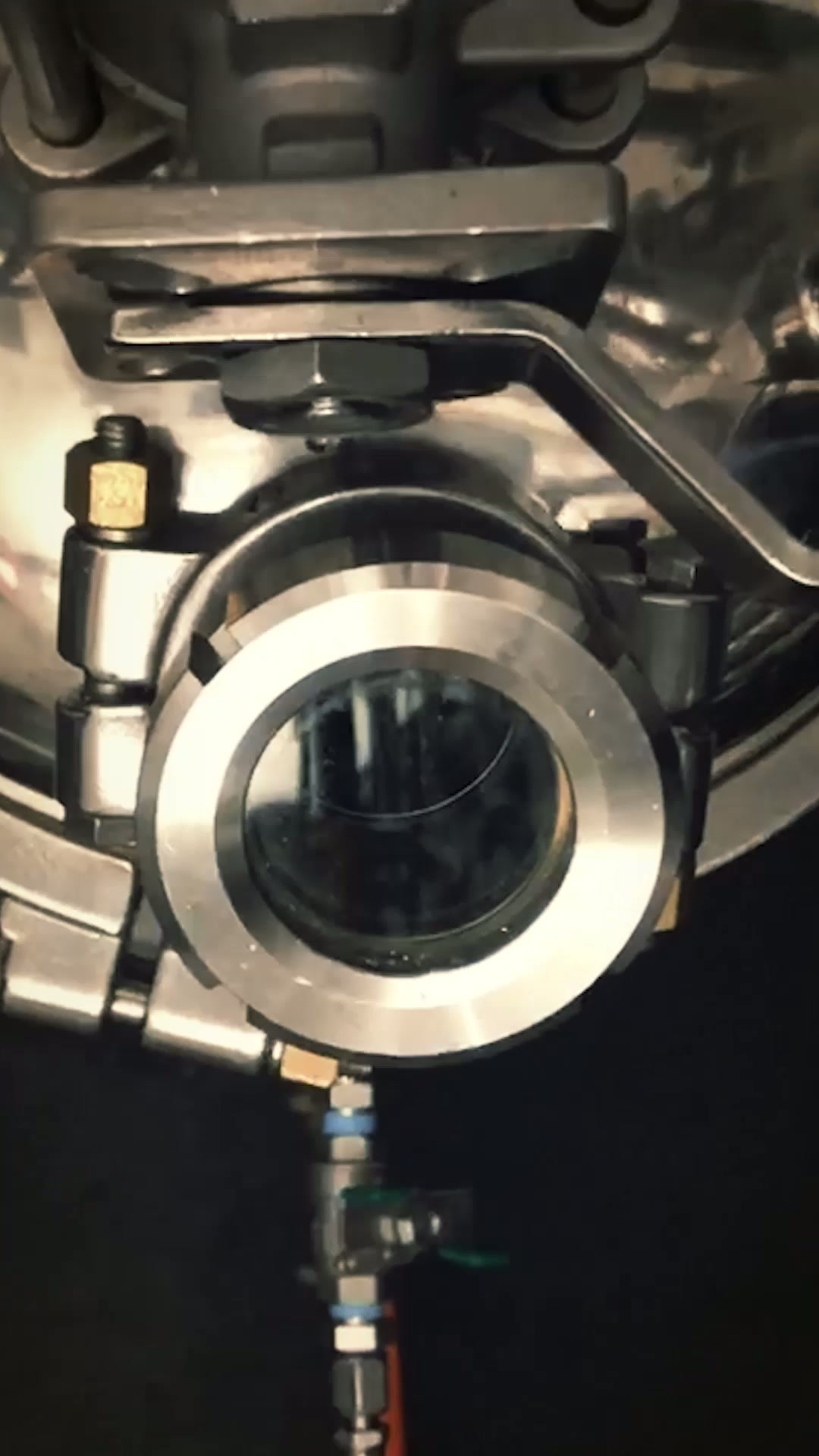
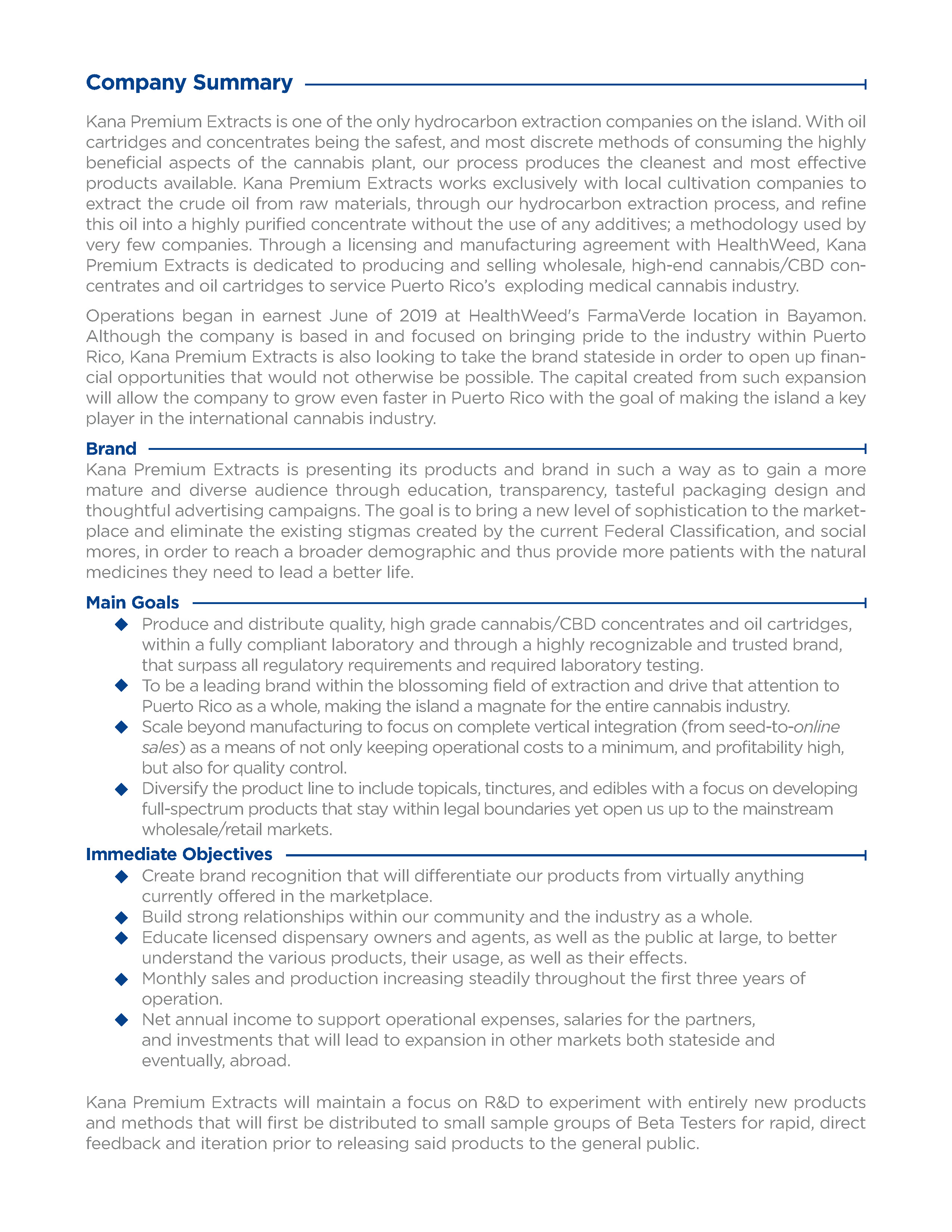
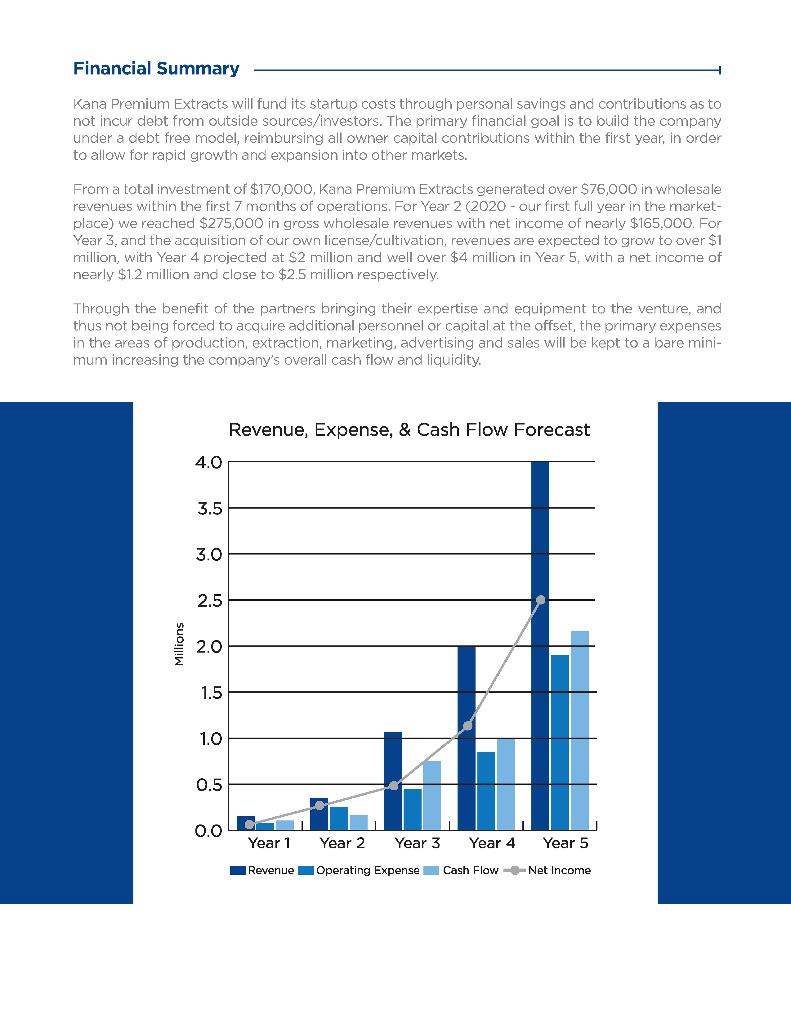
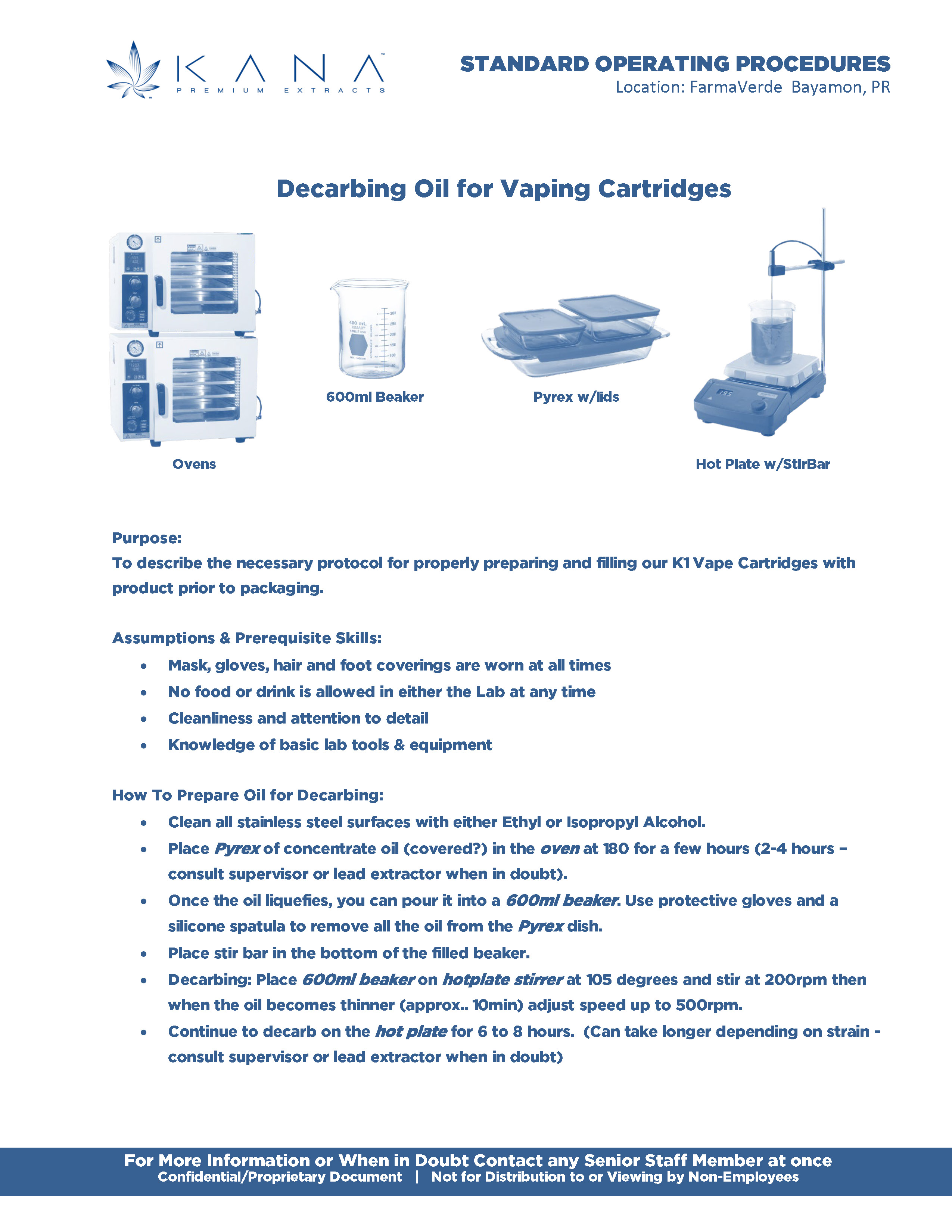
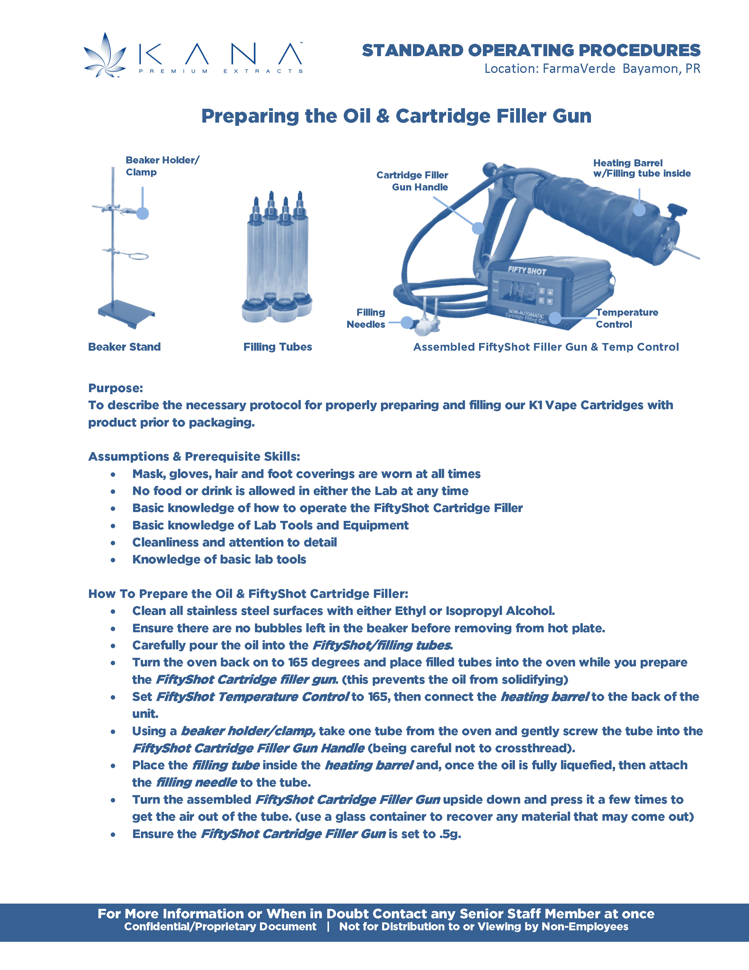
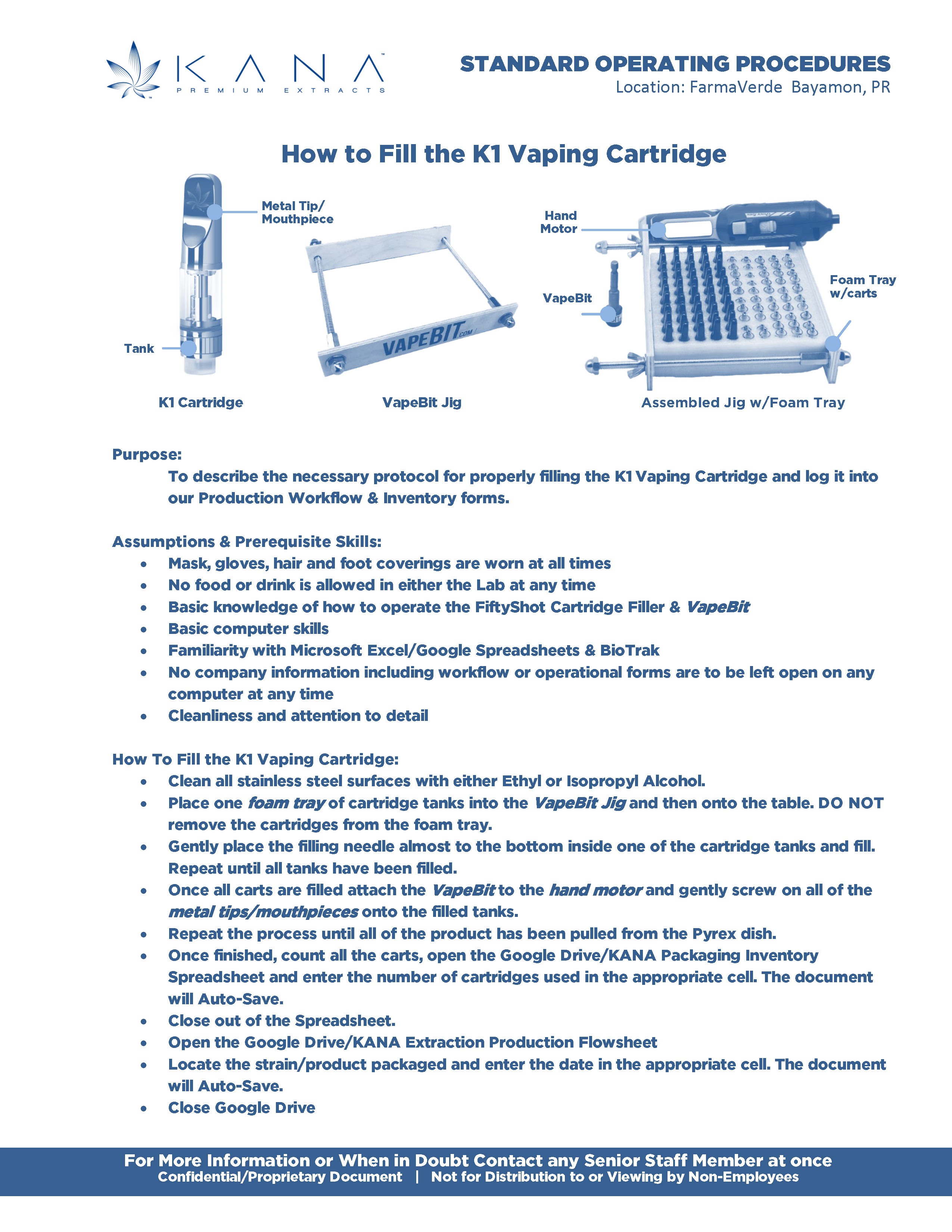
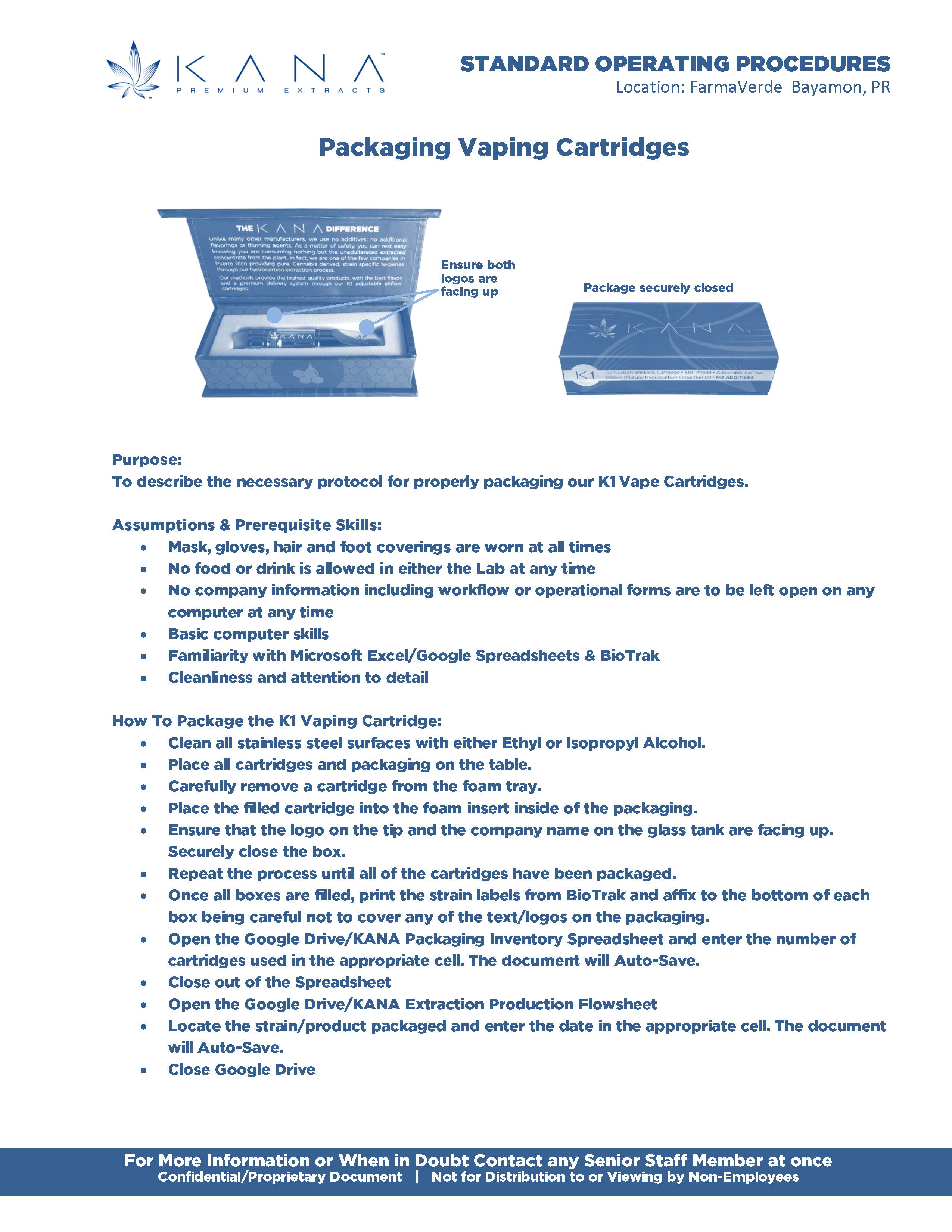
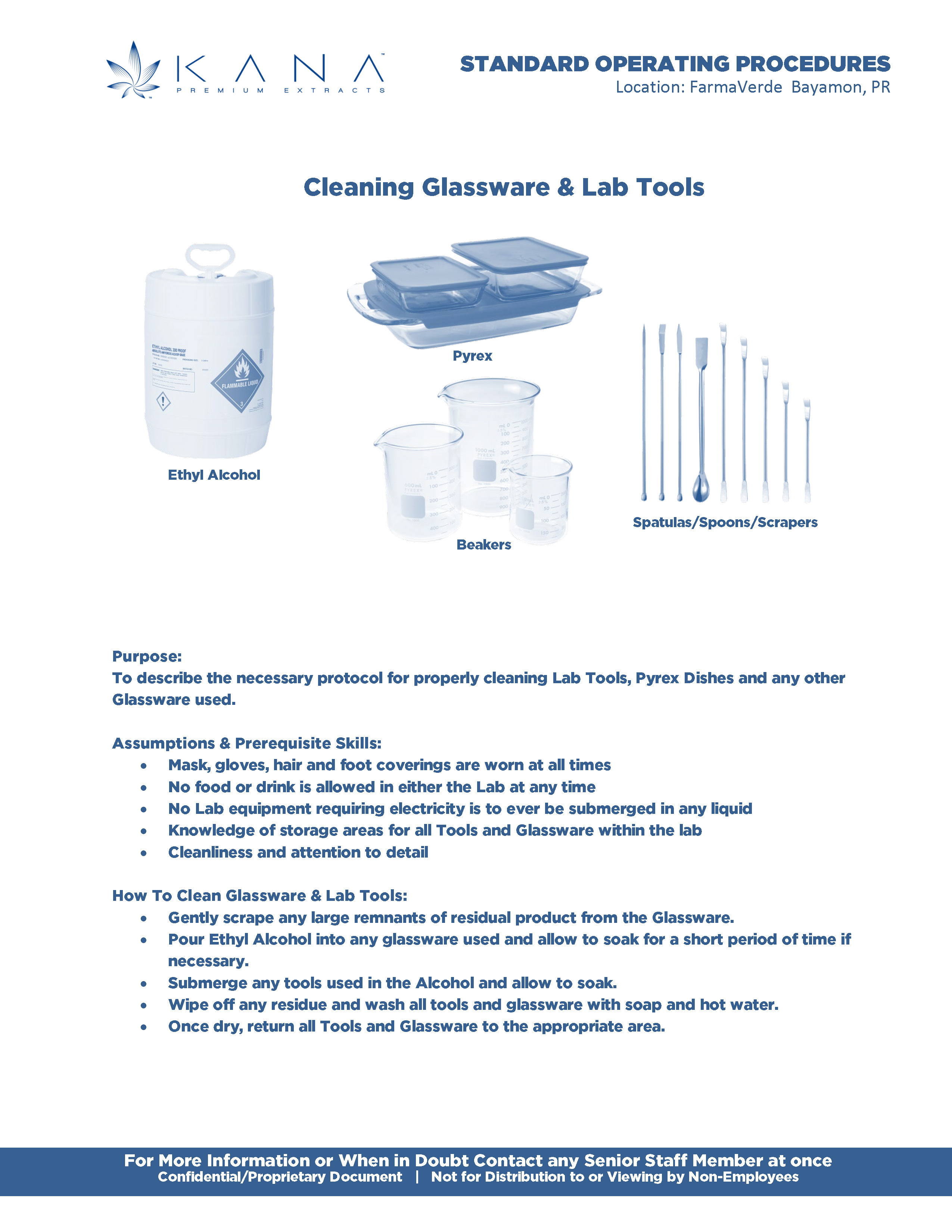
The first challenge was building the brand and the infrastructure at the same time. Our manufacturing partners were eager to get the product to market, so everything was full-throttle from the beginning. I had a basic brand story, but I was still learning the industry, the product and process, and the manufacturing, distribution, and retail sides of the business. I started turning that learning into something useful immediately. I created a Business Overview that became both our strategic guide and the foundation for an investor pitch deck, while working closely with our Lead Extractor and Chemist to understand the lab and manufacturing process. That knowledge eventually informed our SOPs and helped establish consistent protocols around production, cleanliness, security, and documentation.
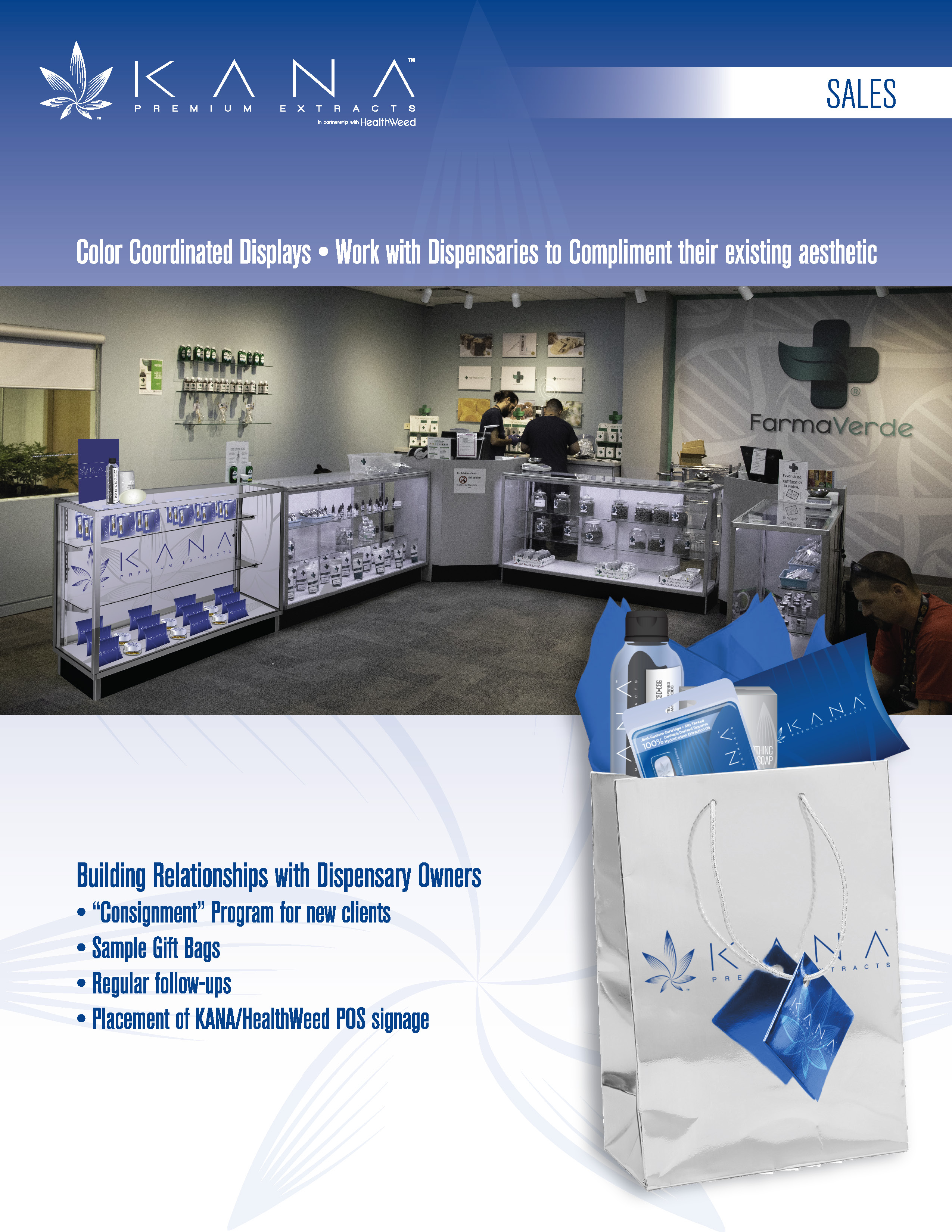
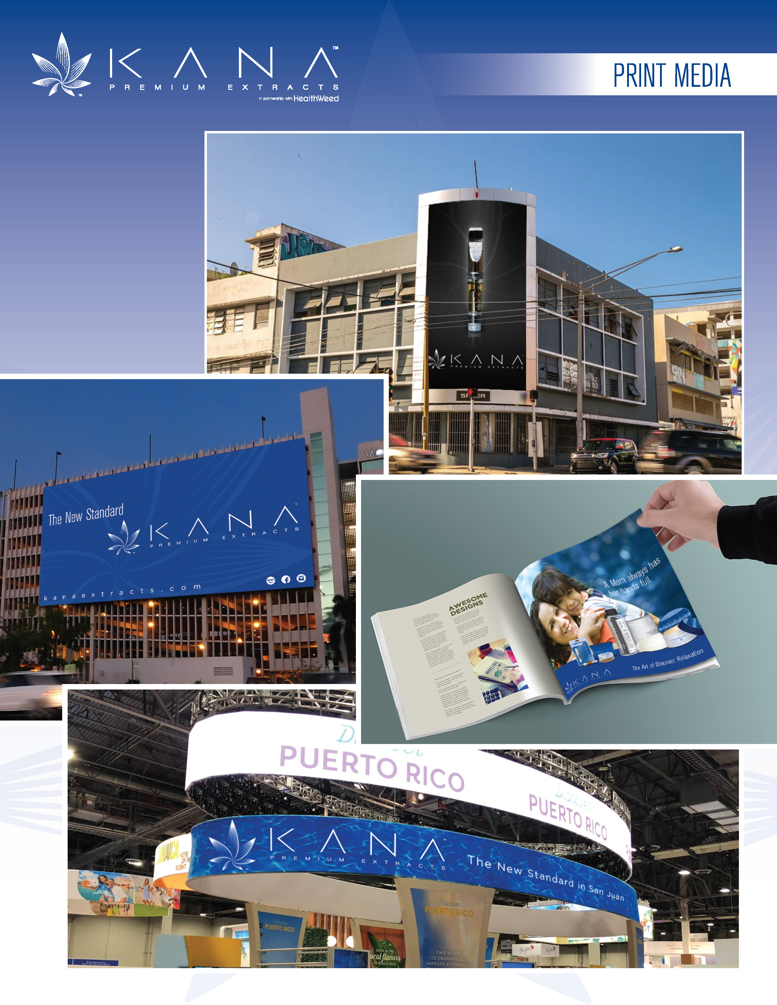
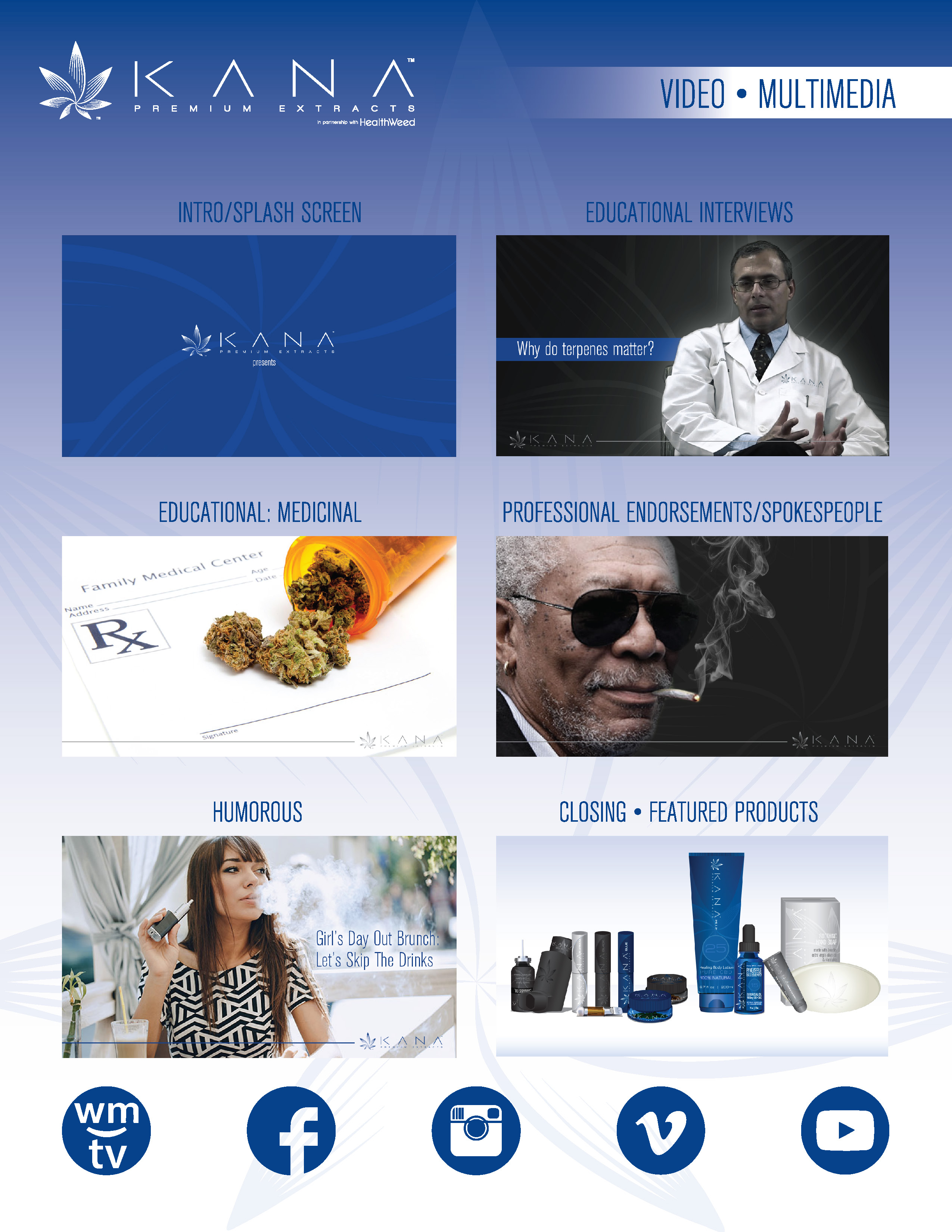
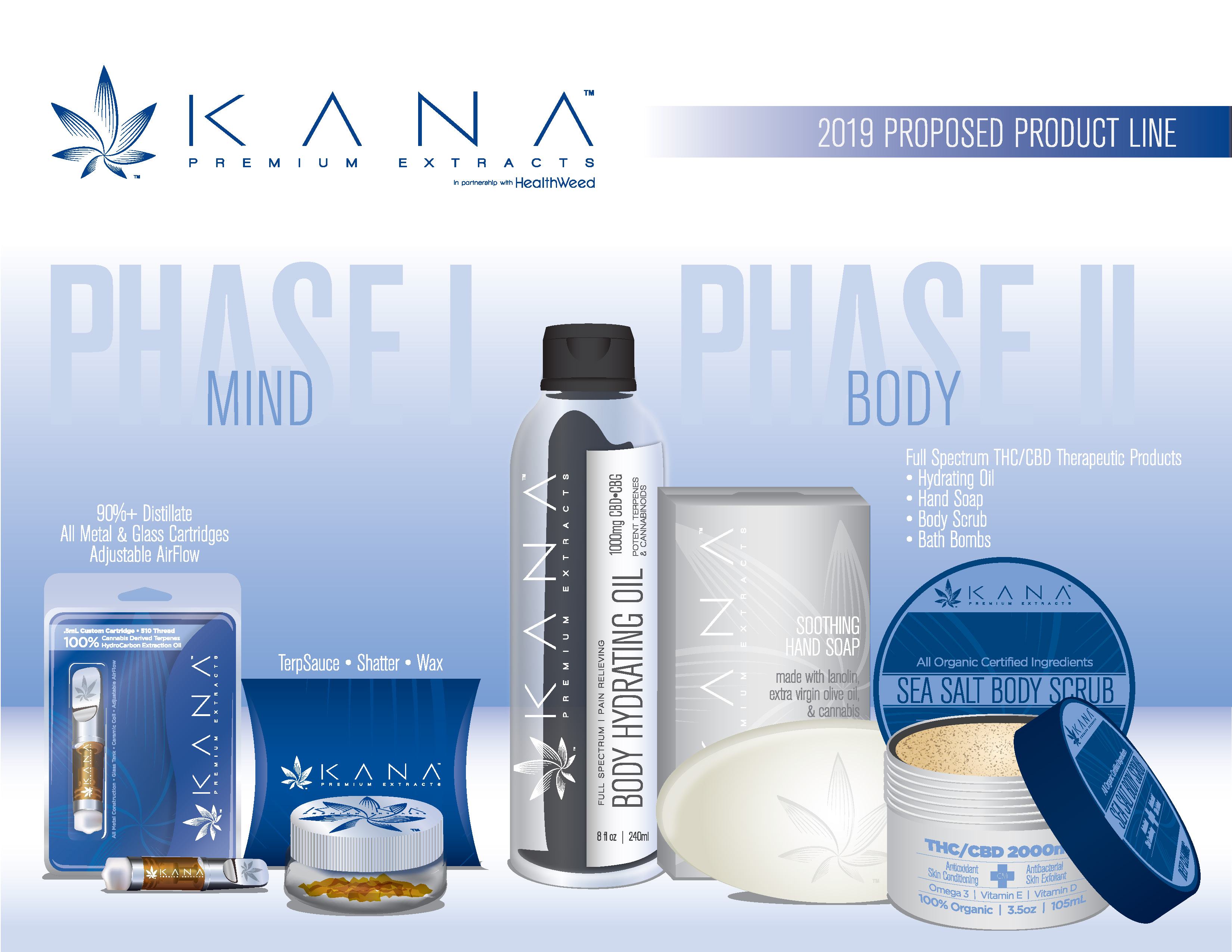
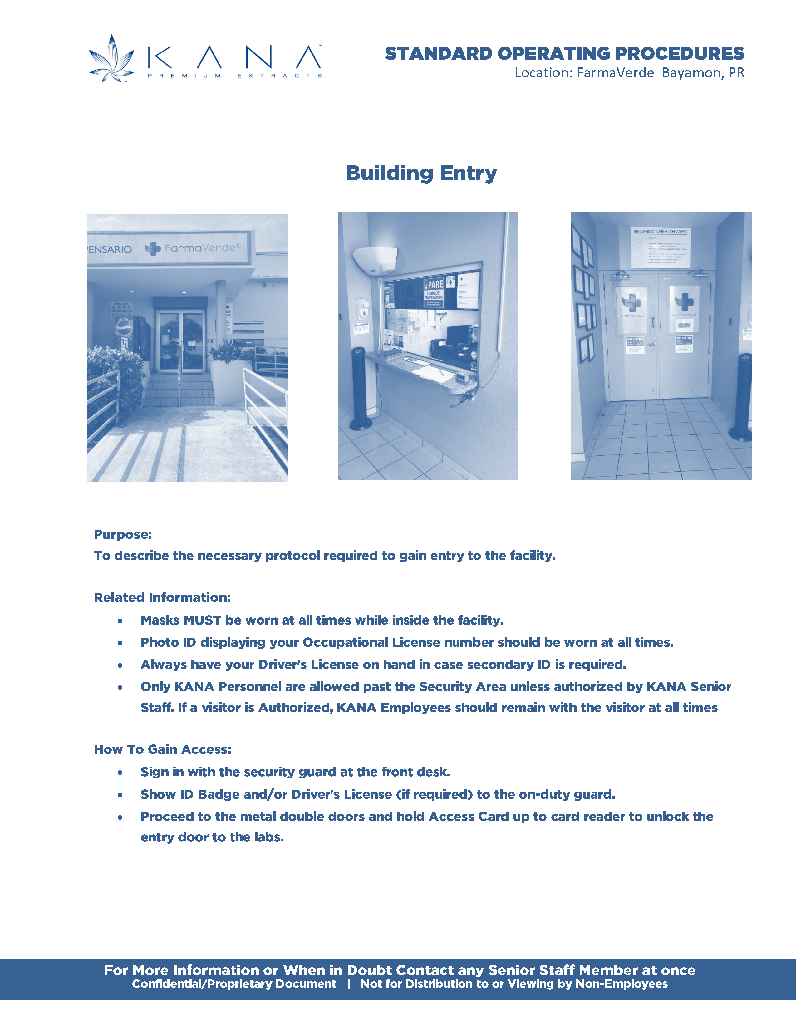
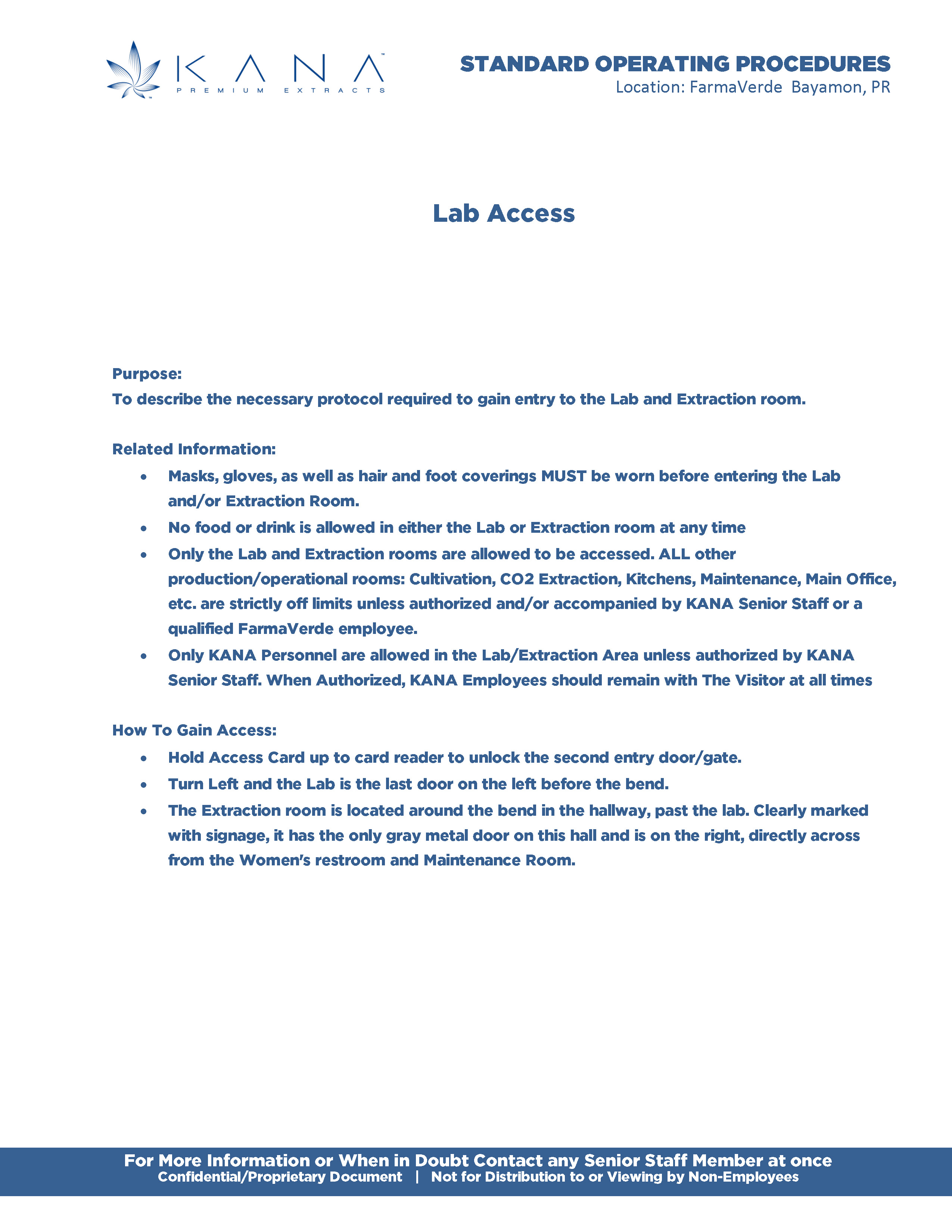
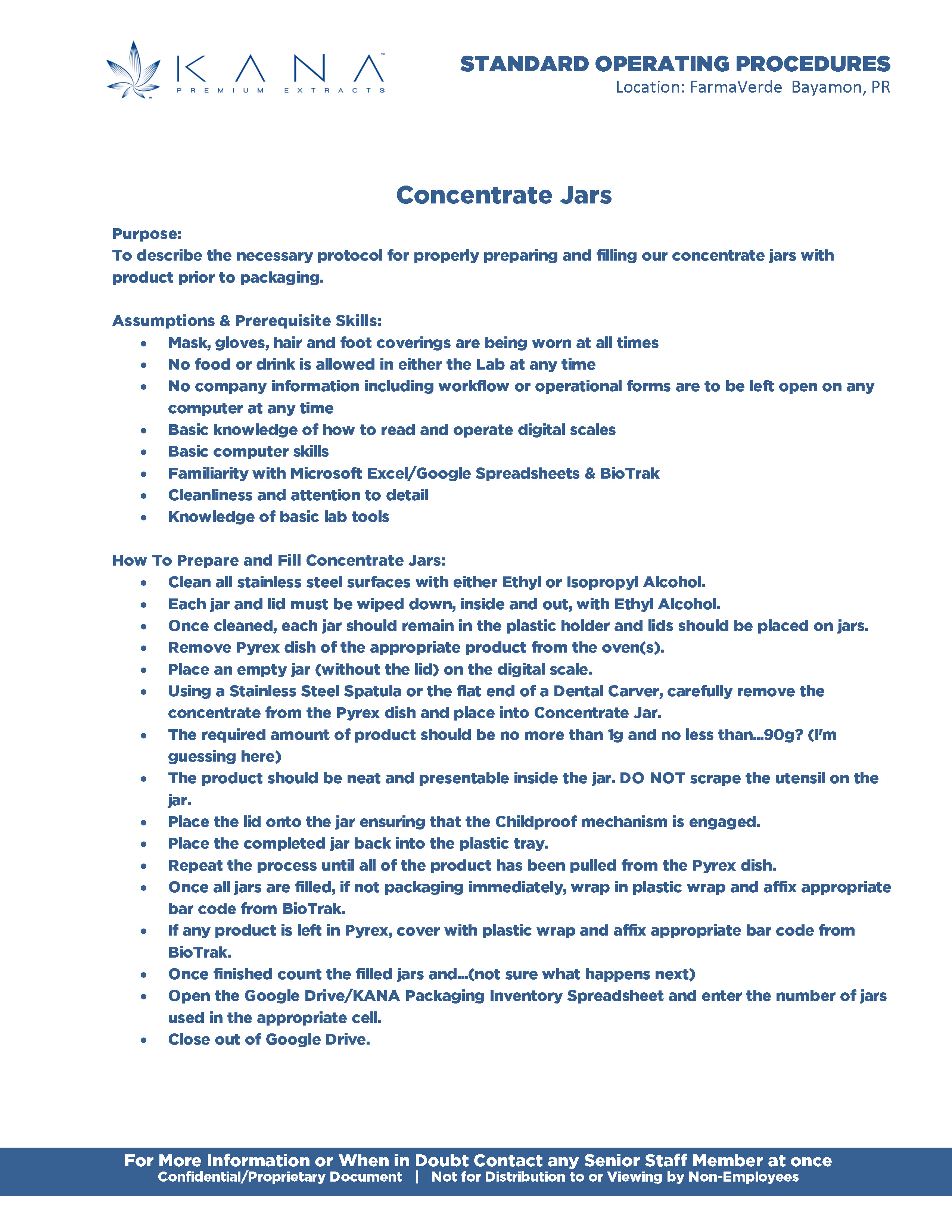
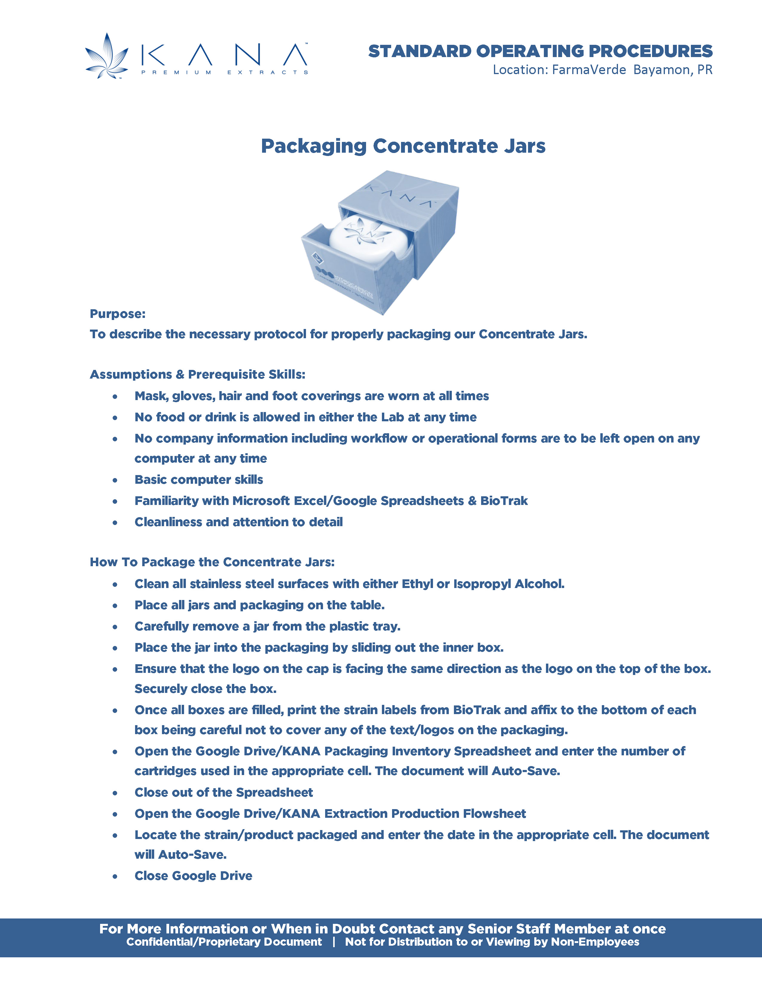
Click to View Gallery
Approach II
Identity and Packaging
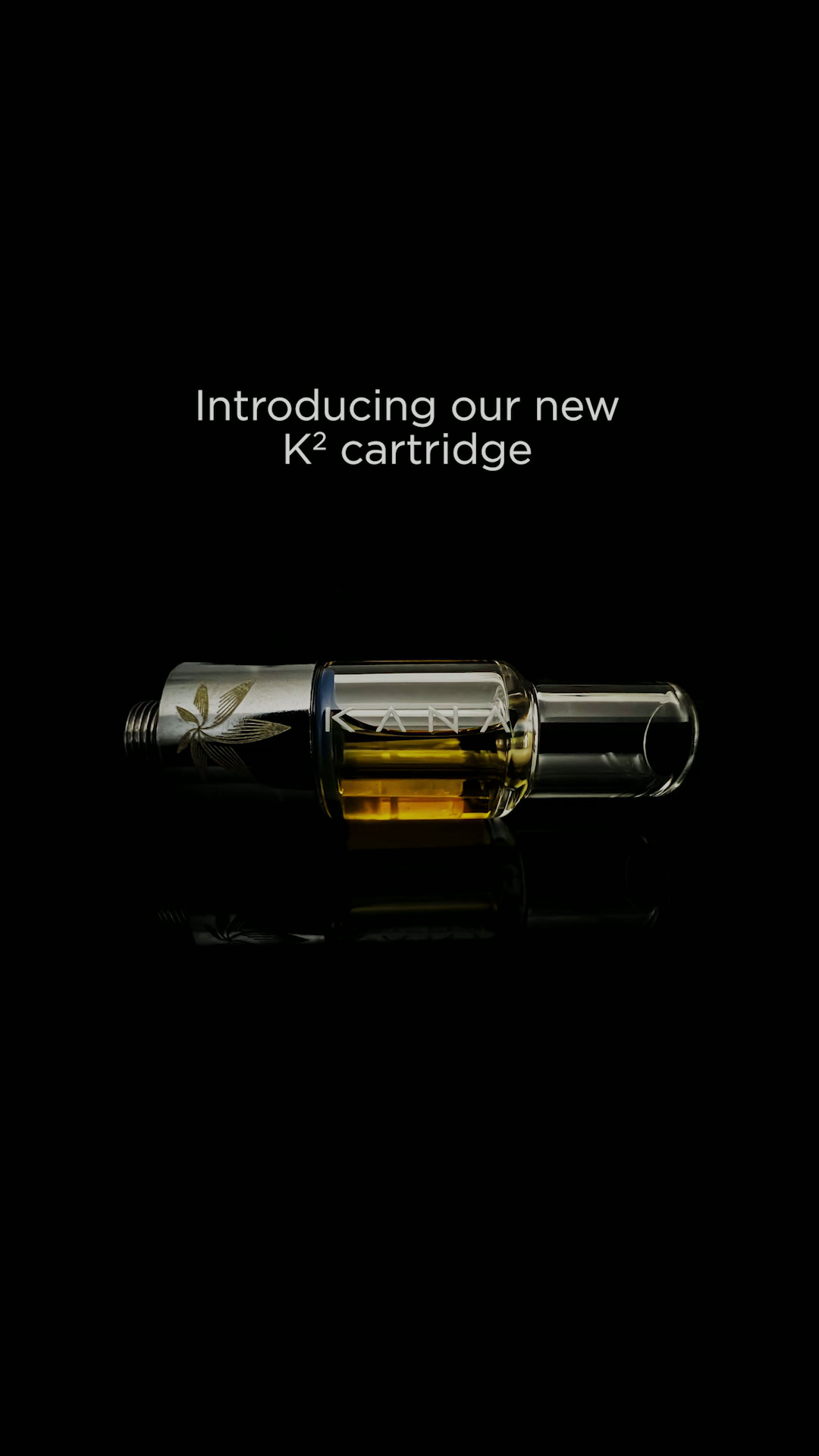
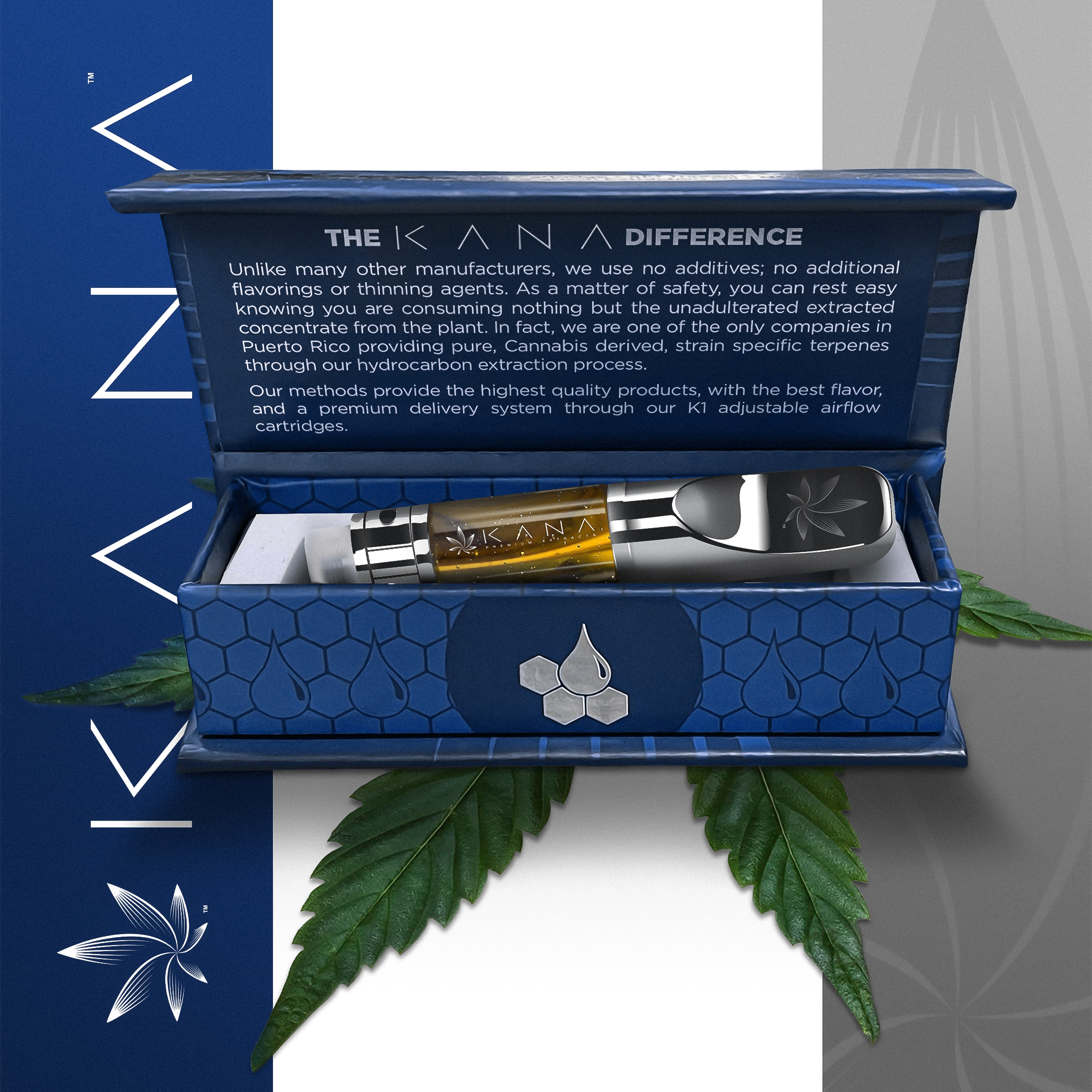
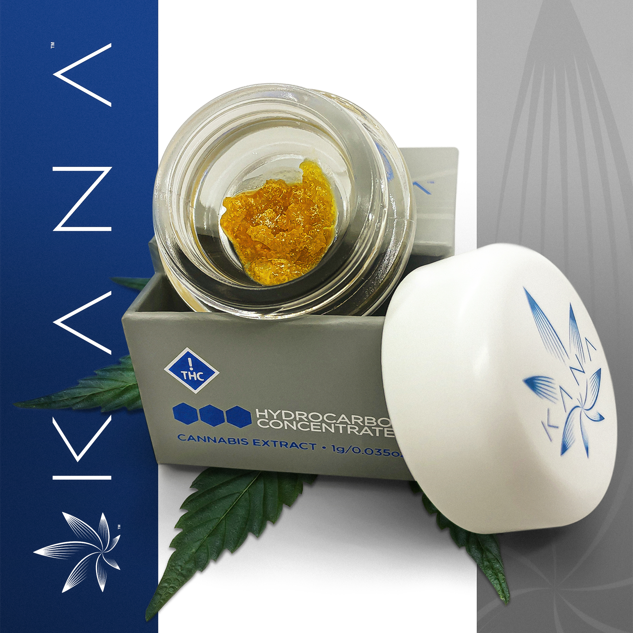
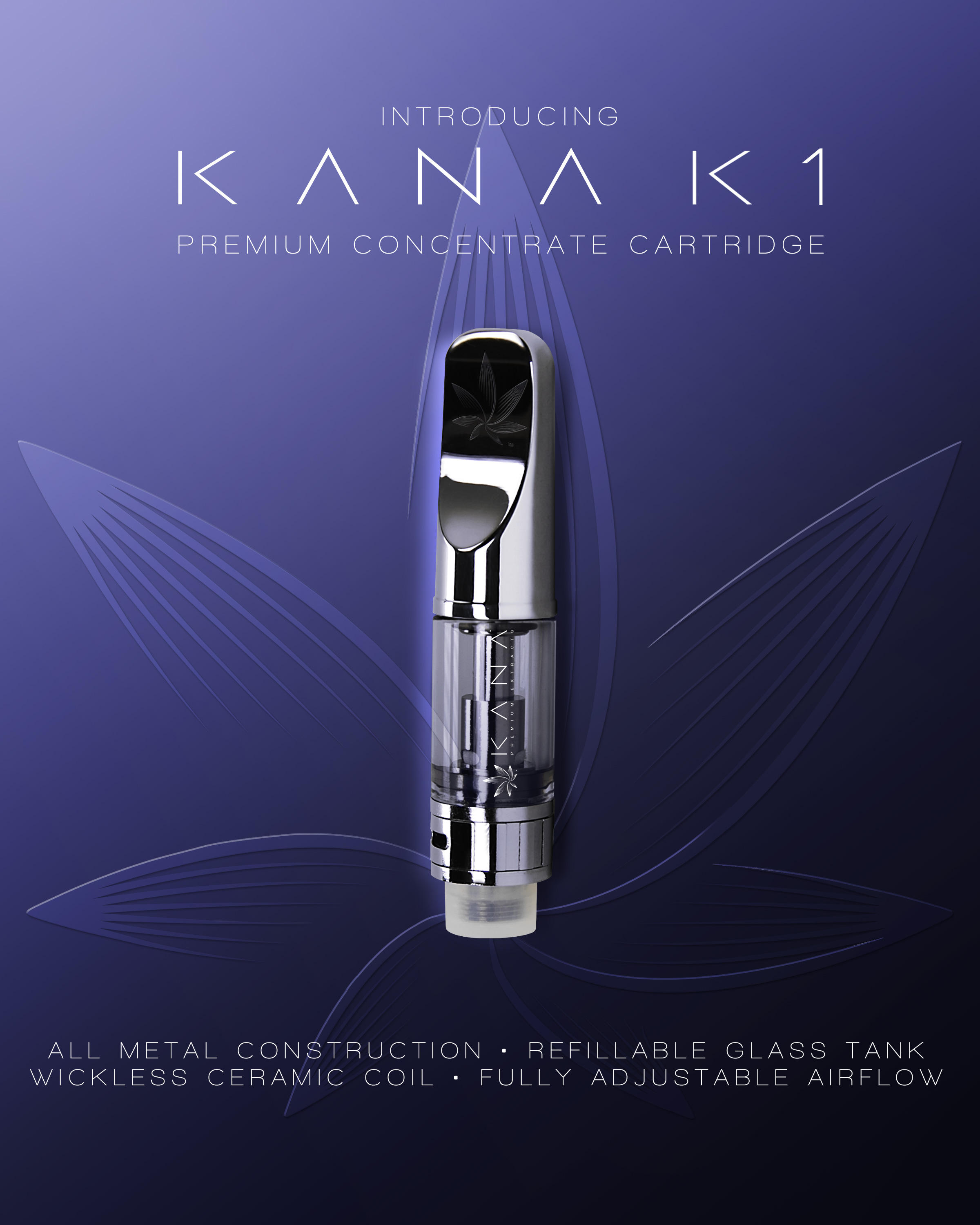
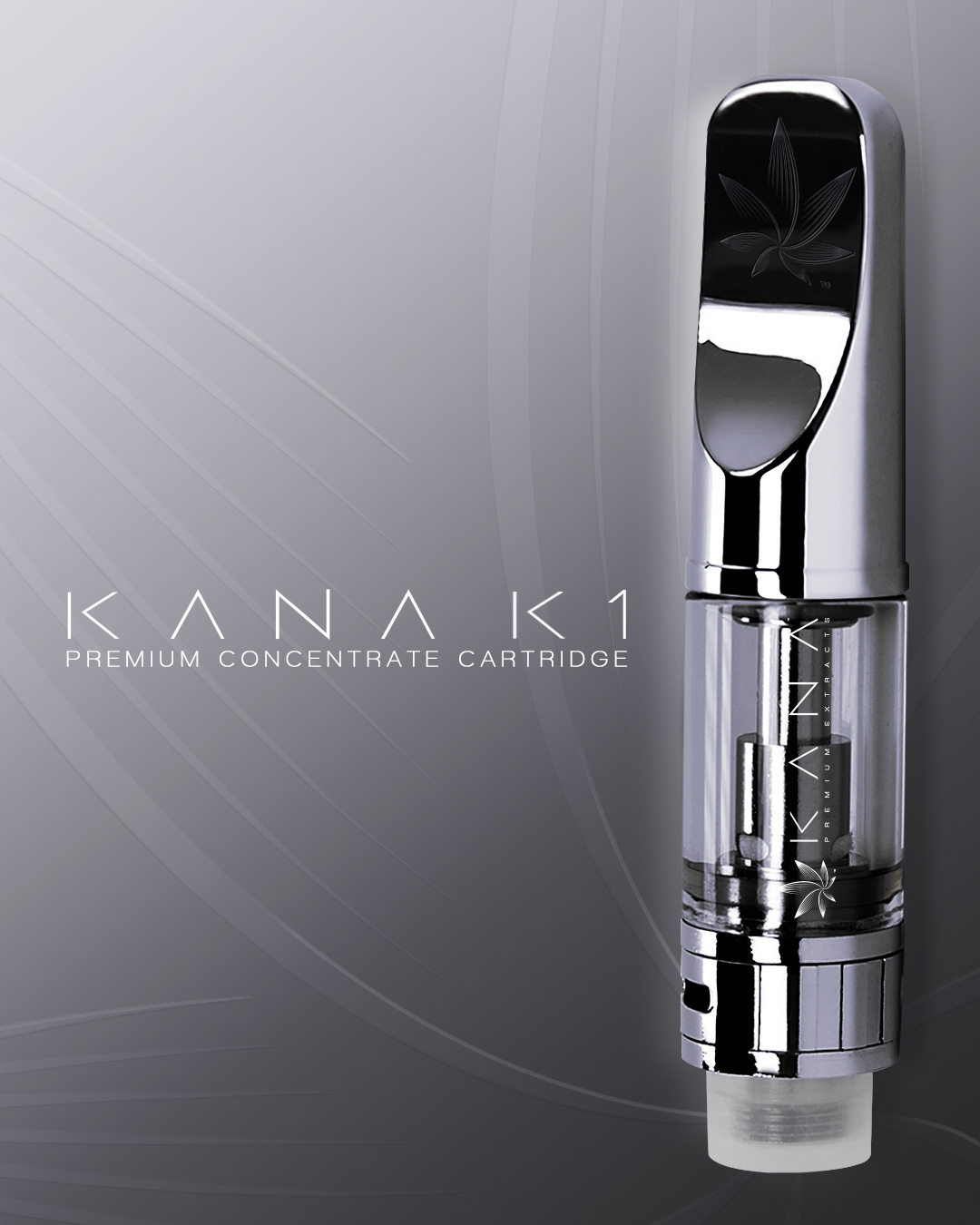
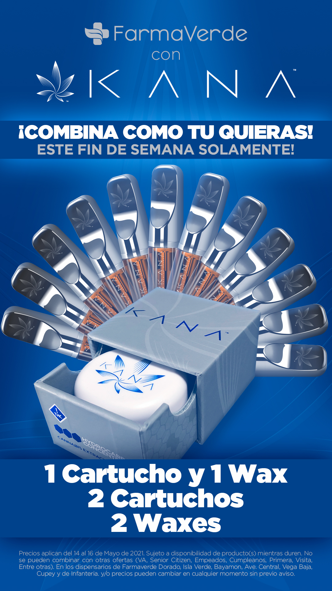
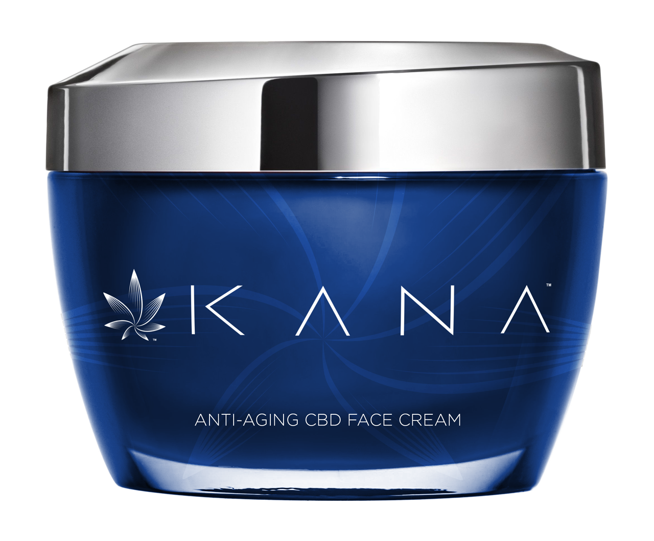
Before I could design the packaging, I needed to establish what KANA would "feel" like. The initial identity became the foundation for everything that followed, from packaging and retail materials to digital content and education. The cannabis market was full of loud, novelty-driven products with colorful, juvenile presentations. KANA was different. We offered a completely unadulterated product, something the island hadn't seen at the time. I wanted the packaging to reflect that quality with a clean, simple, modern presentation. The inspiration came, somewhat unexpectedly, from some of my daughter's makeup. The identity and packaging had to make the product feel different before anyone even knew what was inside. Rather than follow the category's usual visual language, I deliberately pushed KANA toward something cleaner, more modern, and more elevated. The result was packaging that could almost be mistaken for cosmetics. That wasn't accidental. I wanted the presentation to communicate quality and sophistication instead of relying on the visual clichés that dominated the cannabis market.

Click to View Gallery
Approach III
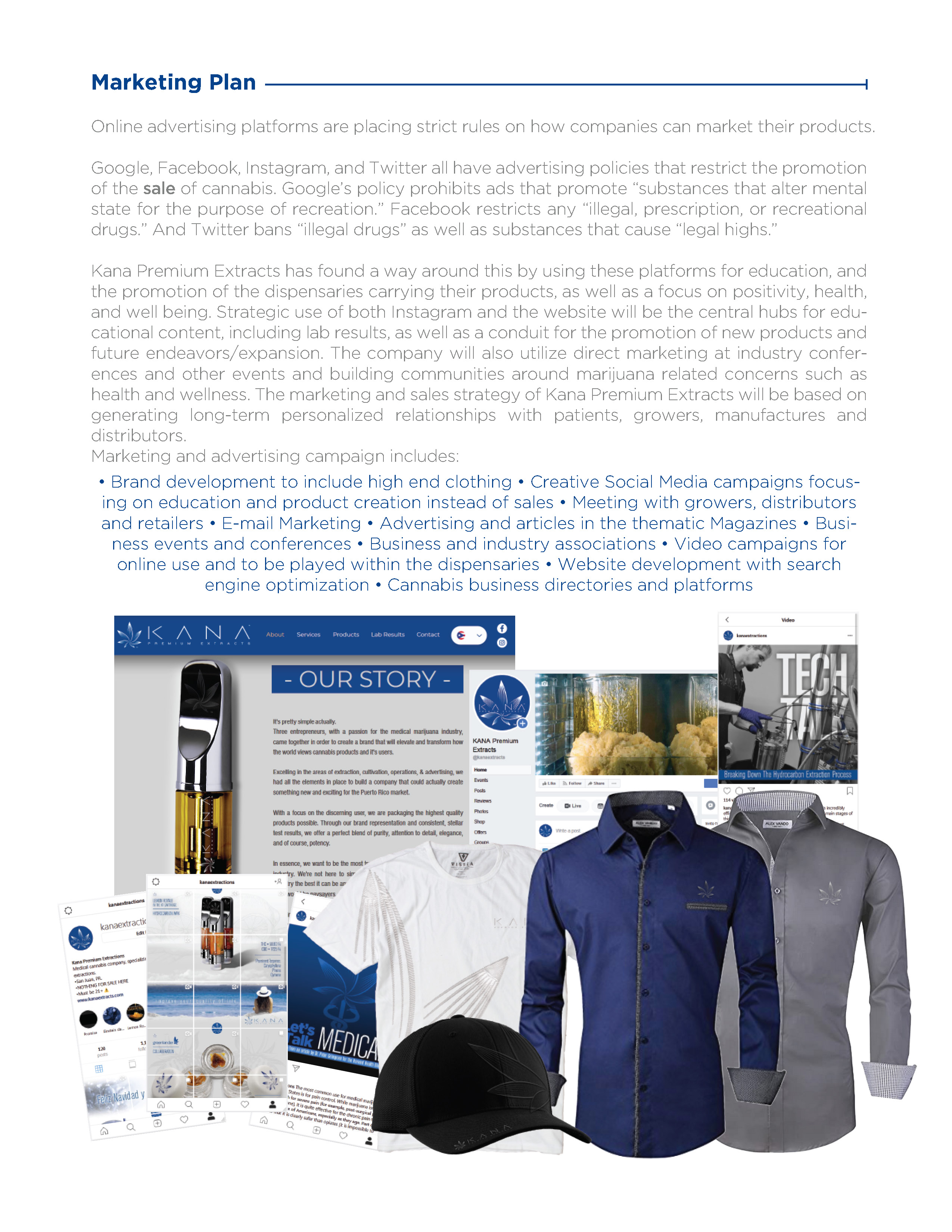
Web & Socials
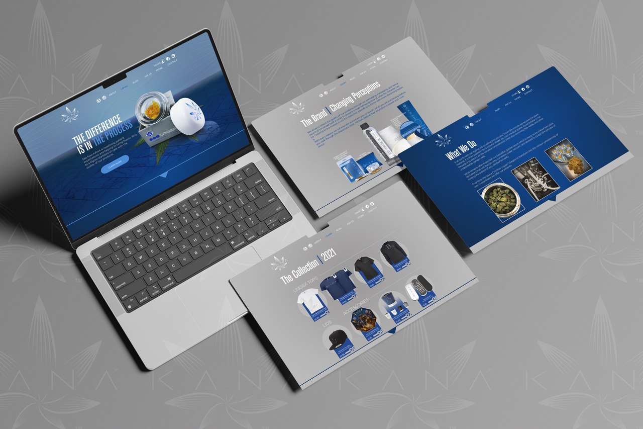
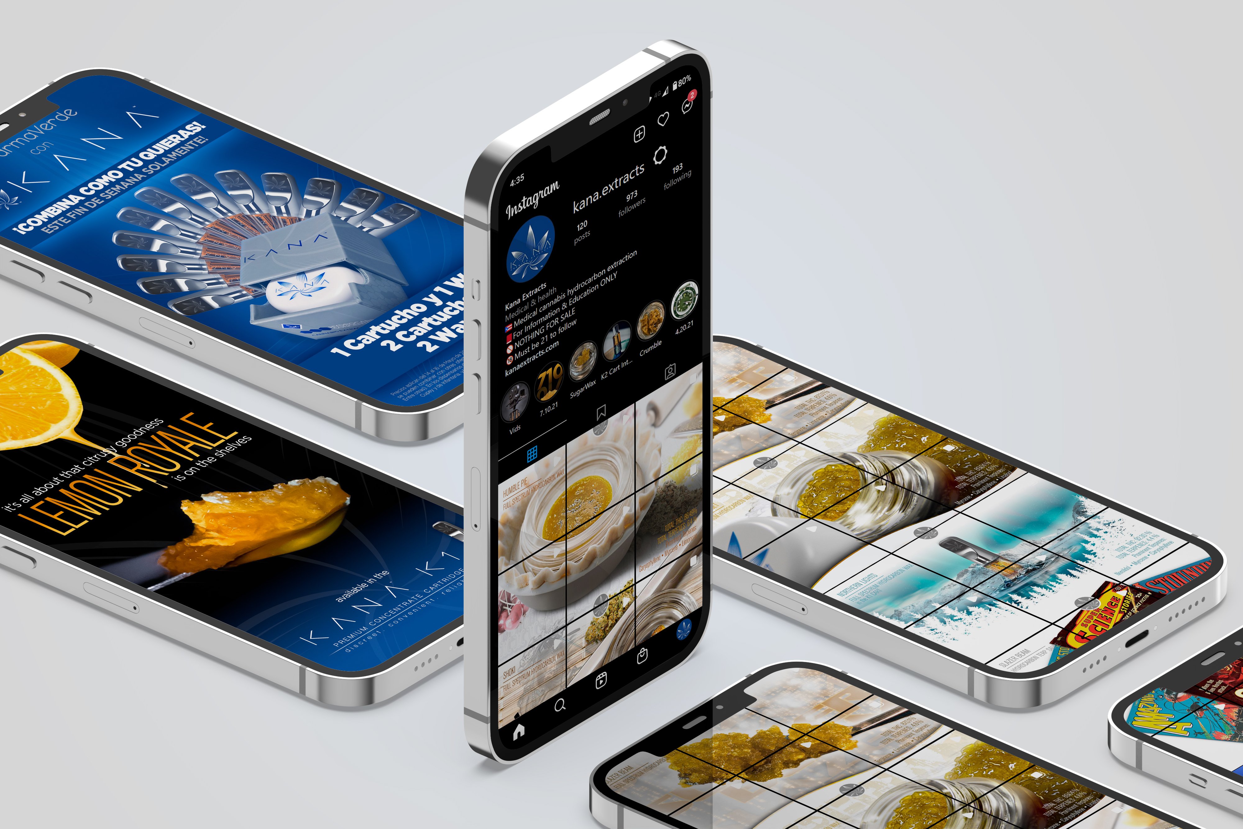
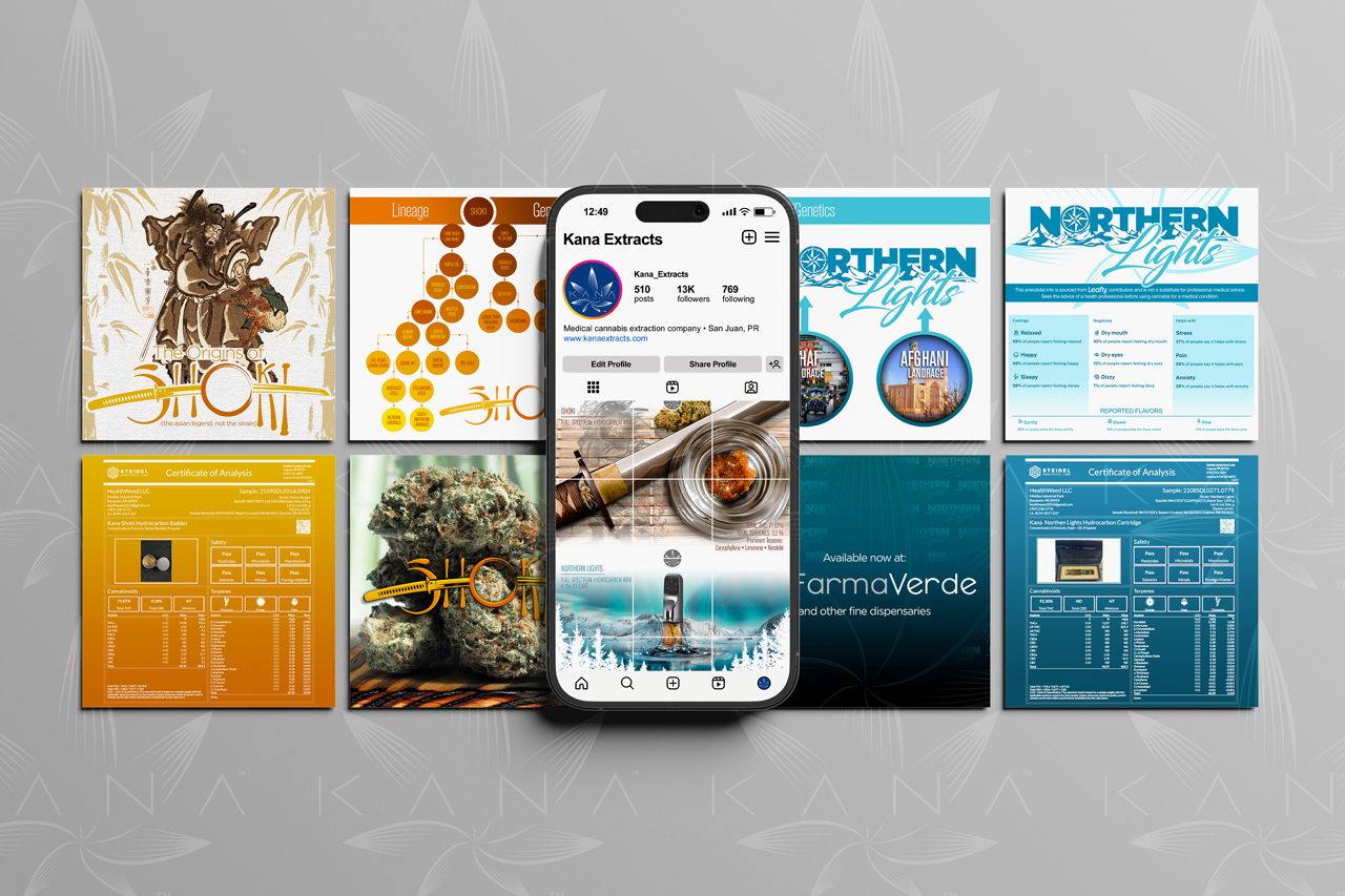
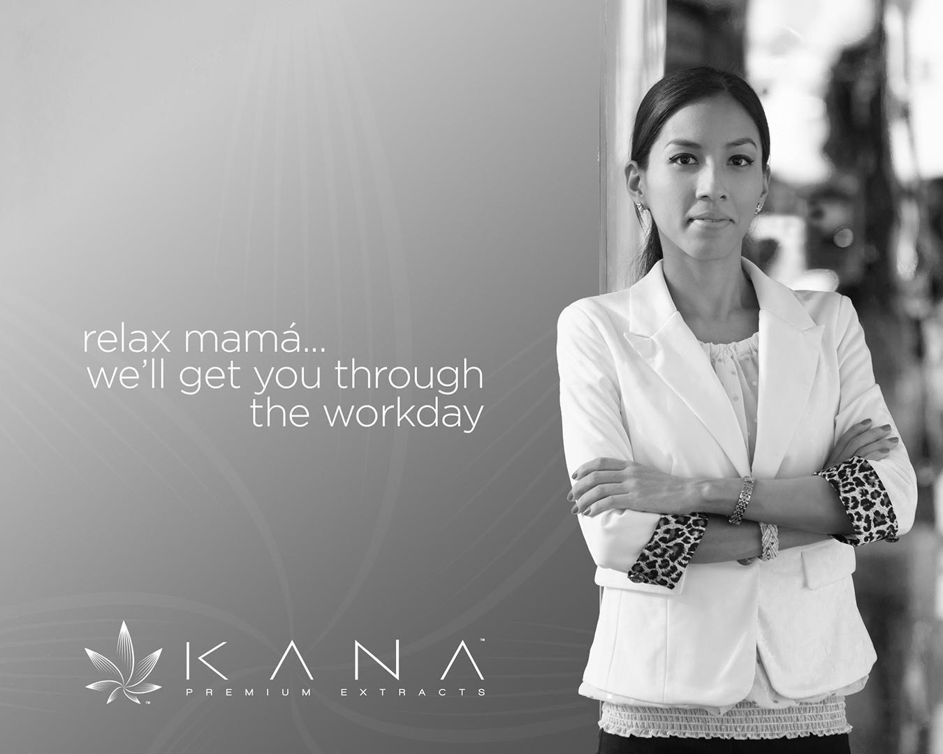
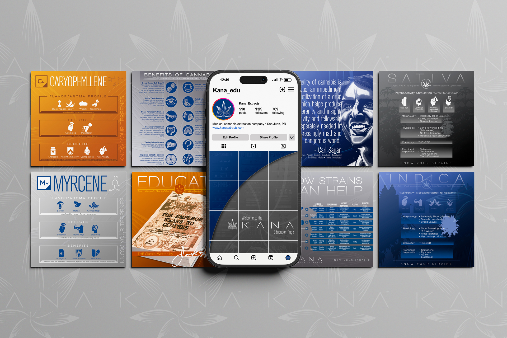
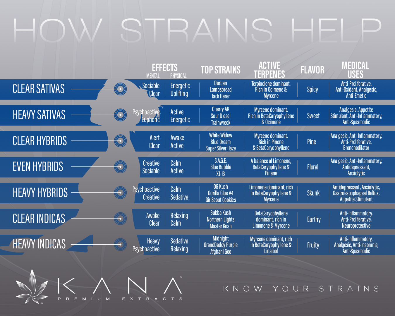
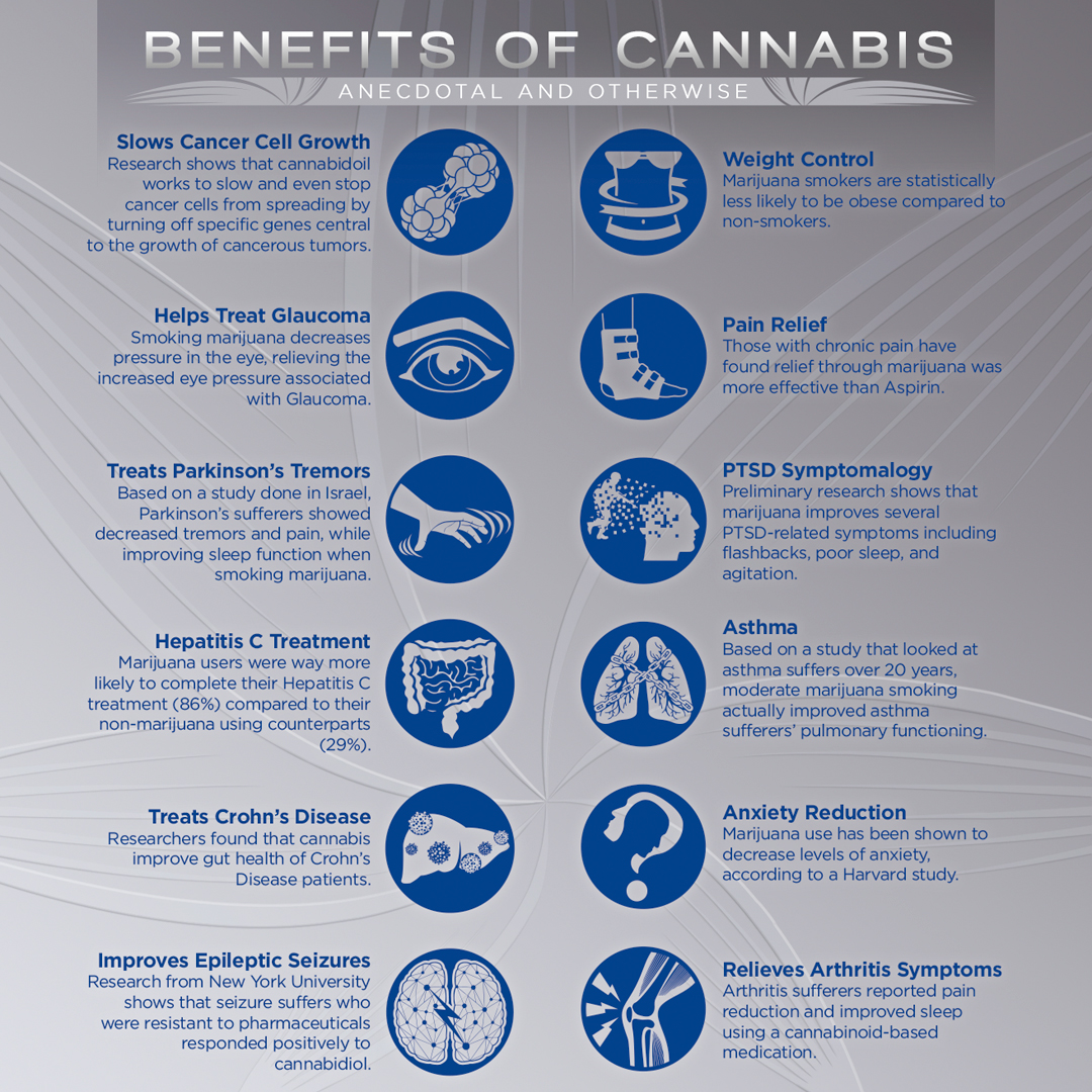
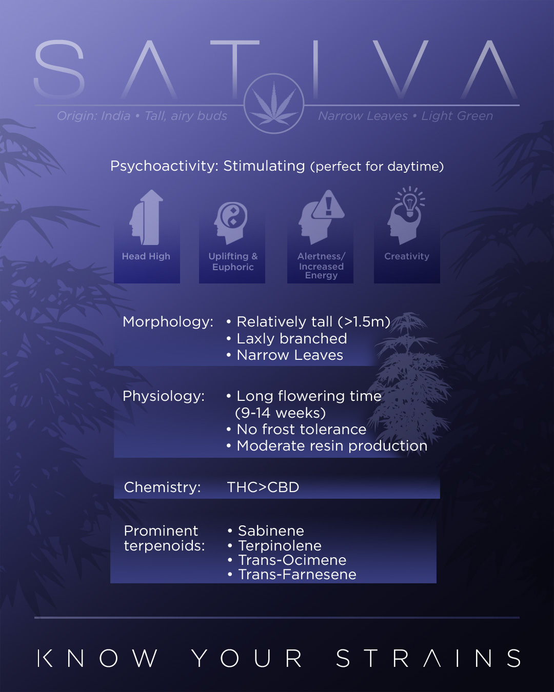
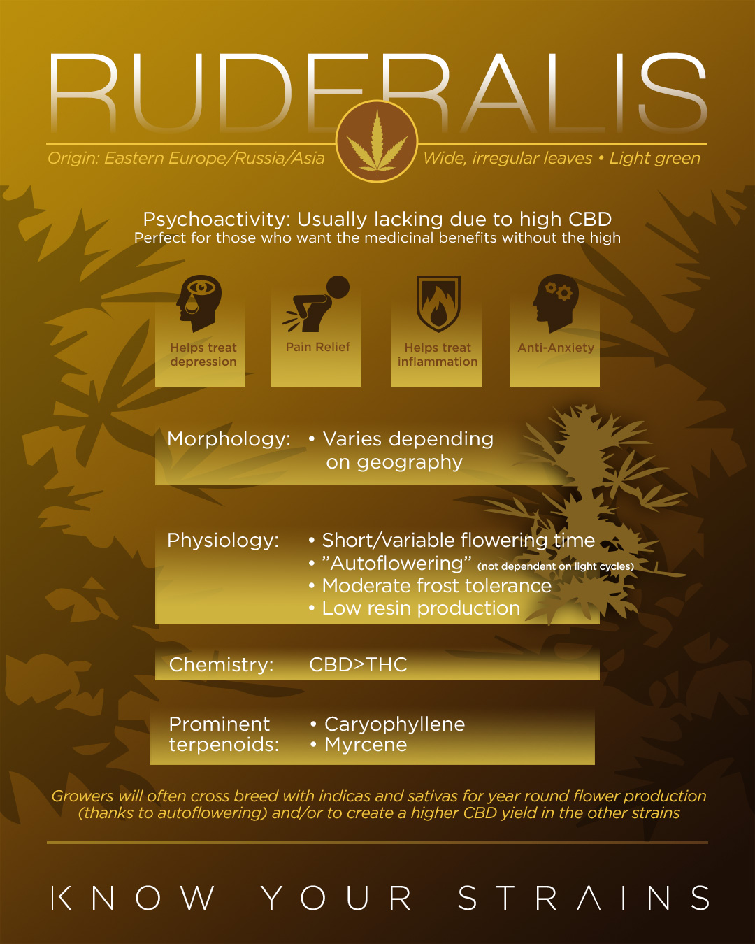
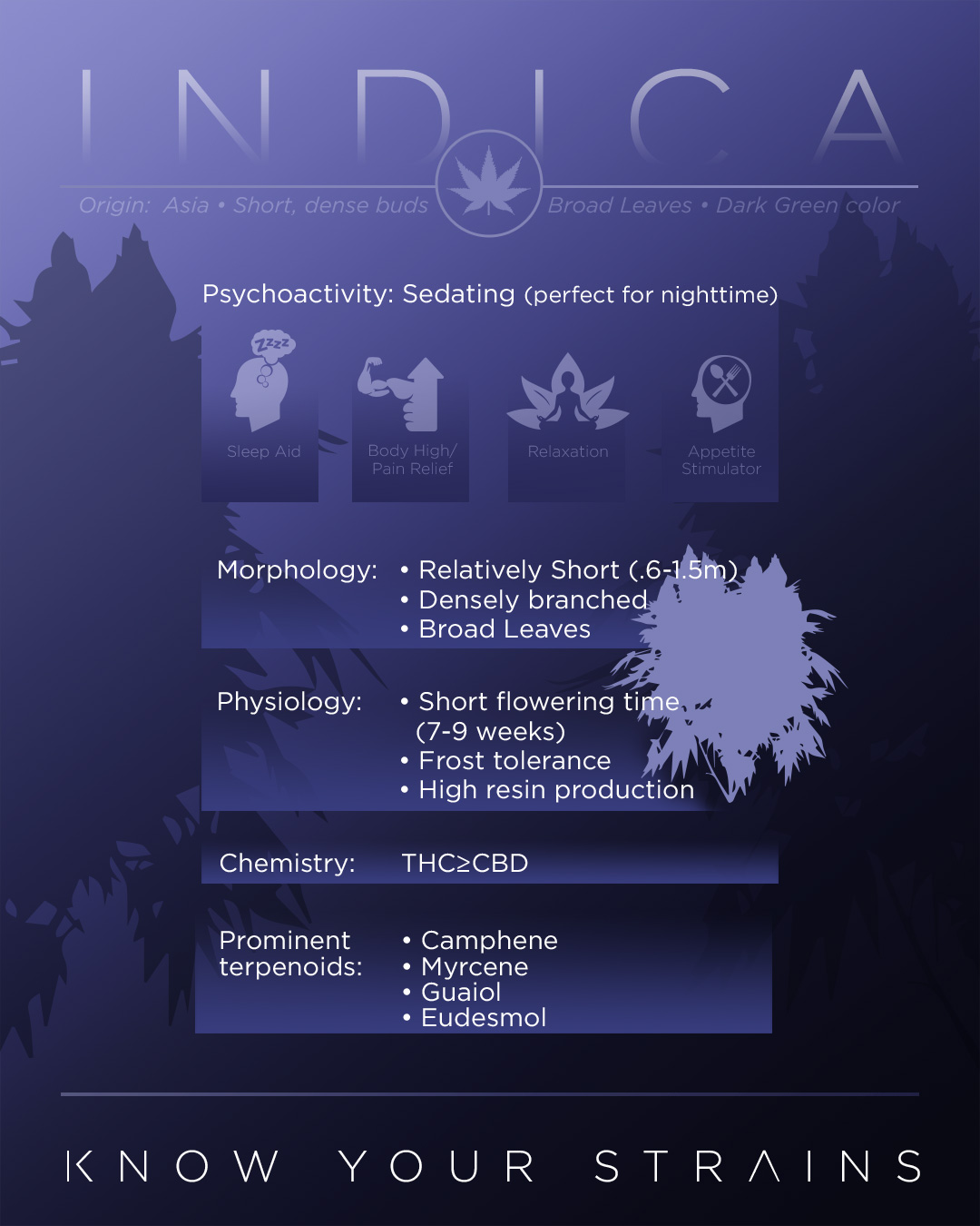
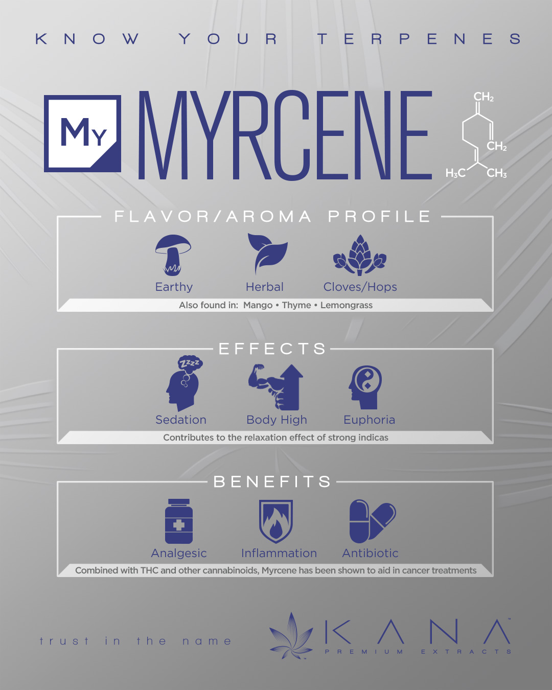
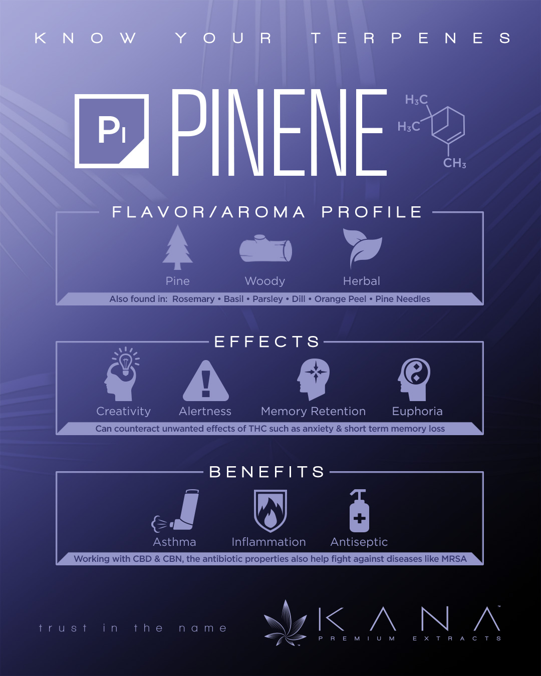
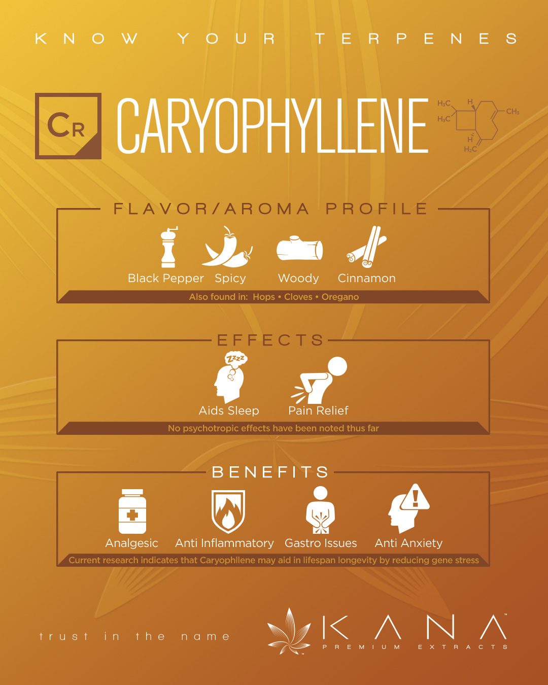
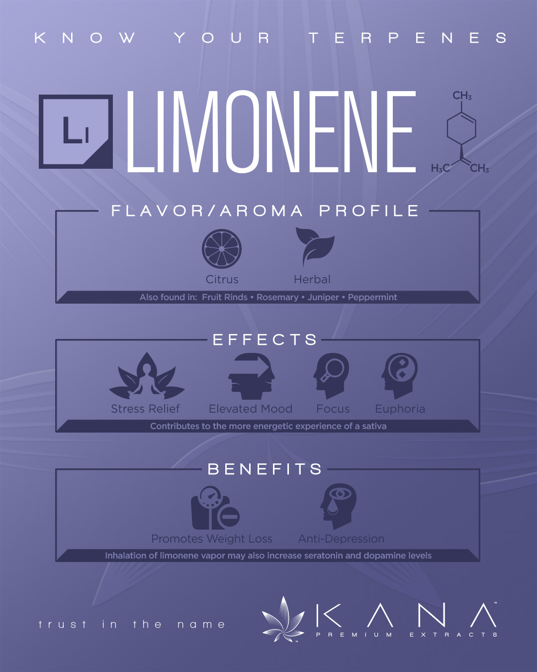
The website needed to be clean and informative while also creating an alternate revenue stream through online merchandise. I built a "LEARN" section to explain our products and manufacturing process, an "ASK US" page where patients could privately submit questions to our chemist and Lead Extractor, and eventually a blog for daily lab notes. You quickly learn in the cannabis space that customers and industry professionals alike can get pretty nerdy about this stuff. Social media was our primary tool for building mindshare, but federal restrictions and platform guidelines severely limited what we could promote. I focused our content on product releases, lifestyle advertising, and education. Instagram was designed specifically as a digital sales book for retailers, allowing reps and buyers to access product-release information from their phones instead of waiting for someone to make a sales call.